The Wolphe Exhibition is a celebration of Berthold Wolphe, a designer as well as a master of calligraphy and type design who helped shaped design in post-war Europe.
In the 1930s Wolphe designed 5 dramatically contrasting typefaces these being: Albertus, Fanfare, Pegasus, Tempest and Sachsenwald. They were used on all publications from book jackets to street signs and packaging.
The typefaces have now been reissued and revived by Monotype as ‘The Wolphe Collection’ with type designer Toshi Omagari restoring and digitalising the typefaces, adding new weights, alternate characters and comprehensive language support.
Evolution of Albertus
It was interesting to see how the letters were formed by looking at Wolphe’s original drawings and notes to which was then fabricated and printed producing the whole typeface collection.
Albertus appeared to be the most known typeface form Wolphe’s collection being used on may different publications, for example books, packaging for Sainsbury’s and on London’s street sign to which it is still used today.
The style of Albertus is fairly minimal yet bold, this being a reason why it is so effective upon street signs as it can be read clearly and seen from a great distance. The serifs upon the letters are too minimal, using slight flicks and angles to add definition and decoration. Whilst the strokes on the letters are thick, heavy and bold, allowing the density to show power and importance when using this typeface.
The typeface Pegasus is one that breaks all kinds of type design rules as it is full of surprises and individual letterforms. For example as some details would share some details such as b, d, p and q, in this typeface they do not. Also every serif in the uppercase alphabet is different however it is this distinctiveness in the typeface that makes it so readable and there is a lot of diversity when reading the letters together. Pegasus worked effectively on book jackets because of thick strokes, accurate angles and straight lines allowing for easy reading at all sizes.
After viewing the exhibition, special access was granted to view the type press machines and test how they work.
The press above made the above leaflet using a collaboration of individual metal letters that had been placed together to create the above passage.
After this we had the opportunity to create our own bookmarks using the printing press show above. This was a great experience to be able to see and try first hand how printing was created however did take some muscle!
I found this exhibition very useful and informative through looking at how typefaces were firstly designed, developed and then printed to be used it all different publications. This can too be related to my APP work as I am looking into typography when designing the campaign posters, especially when setting type and making decisions on what type to use.

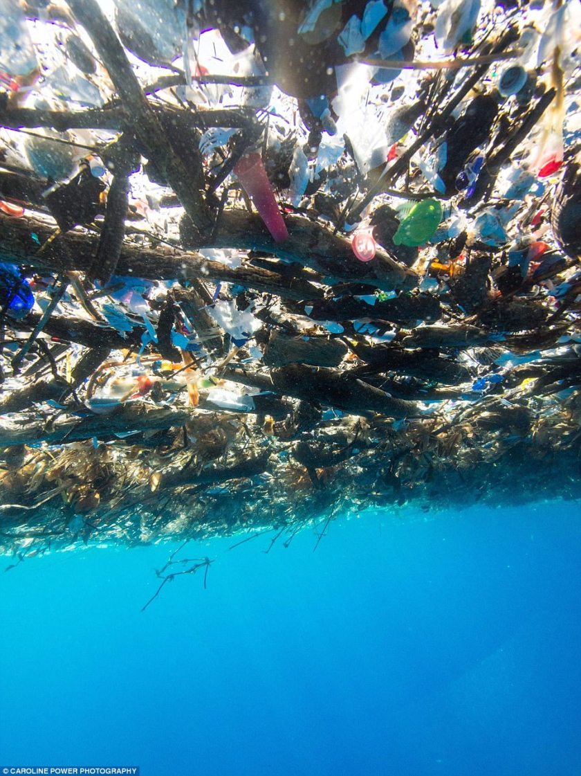
 The bottom left thumbnail shows the facts placed in bold lettering filling up the space. Its background would feature a photography affect using ink in water which would give the impression it is plastic floating with the ocean, similar to the example adjacent. However although you can purchase this effect online, it could be difficult to achieve myself without having a large container of water to place the ink within. Also it could be difficult for every type of audience who looks at the poster to see the ink as a signifier to plastic.